-
Brad Smith
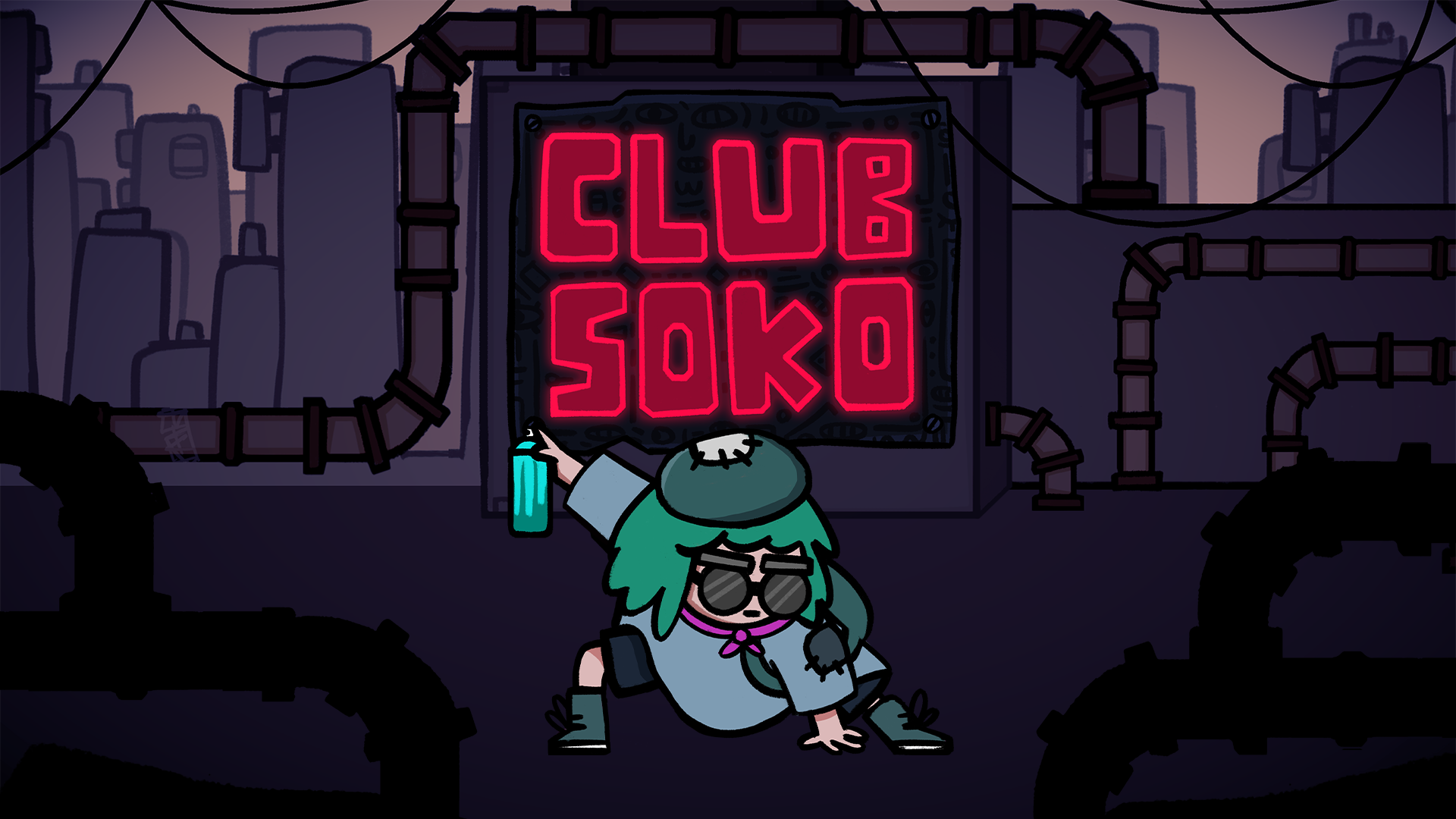
Accessibility of Club Soko
Preamble
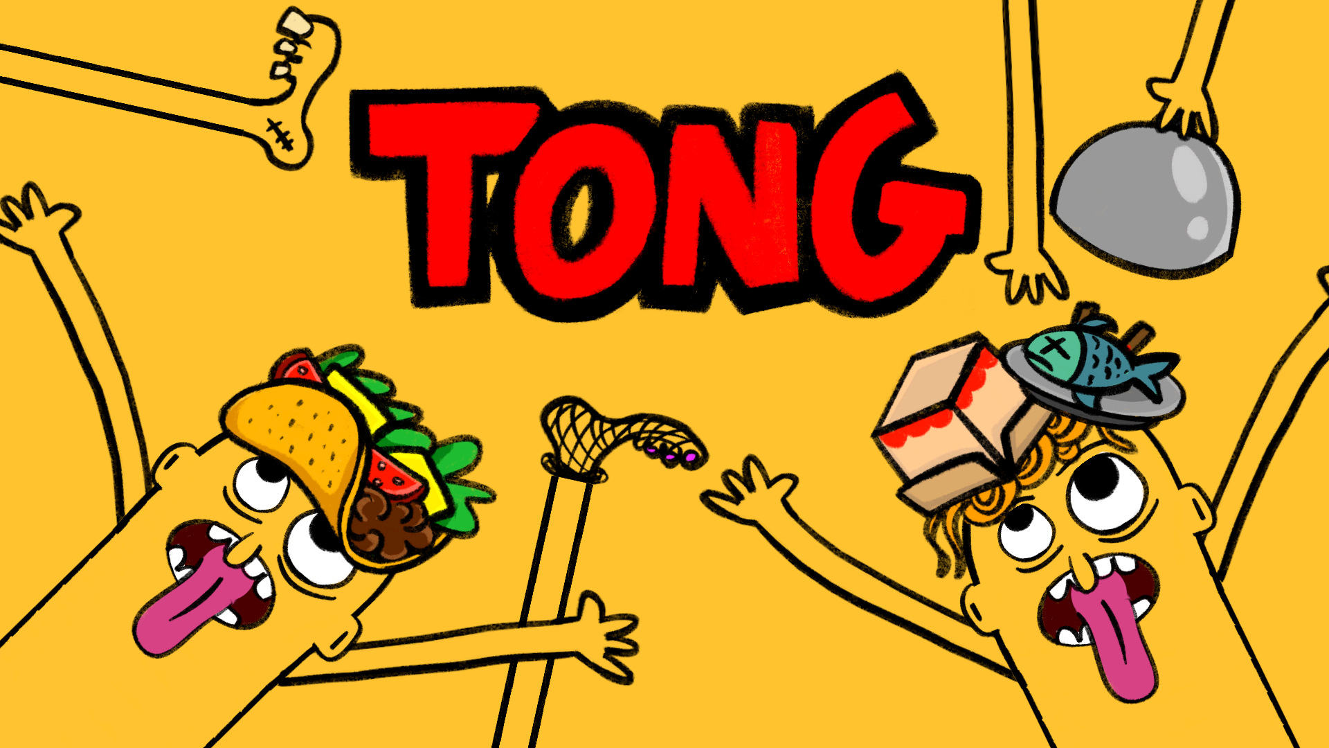
Hey all, we’re back with another blog post sharing some brief insight on what you can expect in terms of accessibility options in Club Soko! As before, this builds upon some of our existing learnings from our last game Tong, if you’re curious what settings were featured you can read about that project here and maybe buy a copy if you’re keen to help some indies out!
To date, Club Soko has been in development for over a year now. Since then, our tiny team of mainly 3 people: Thomas Andrews; Jake Denton and myself Brad Smith have been chipping away on the game trying to make a meaningful contribution to the Sokoban subgenre!
Another Game Jam Game
The original prototype was made in around 5 days for the CrazyGames Web Jam under the theme ‘Everything Is A Remix’ back in November 2024. It was originally designed to utilise our custom tooling in Unity and explore grid-based movement with a player character. Around this time I also only just started learning Procreate as I finally picked up an iPad after thinking about it for many years. I’m so glad I did! This jam was basically the one responsible for me figuring out a Procreate workflow that I still use to this day. That week of the jam I remember being unable to contribute much during the first few days as I was helping move my younger sister out of her flat. There was a lot going on around that time and a good chunk of the art for the prototype was drawn on an iPad crowded in the passenger seat of a white transit van – good times!
While our team didn’t take home the prize money or invited on the platform for Club Soko we were awarded a certificate for participation. Later on throughout the years CrazyGames approved some of our older games onto the platform. I have fond memories of 2024 and specifically that jam as this was the year we hired our first programmer Jake Denton. Around that time we hadn’t been working together for too long and I believe this was our first game jam as a team together which was a lot of fun! Both those guys are great to work with and open to creative weirdness and experimentation.
Anyway… as we’re getting nearer to the launch of Club Soko, we’re exited to start sharing more of the features that you’ll find in the game! We’re chuffed to be having another game under our belt that builds upon the Miracle Tea catalogue.
Accessibility Information
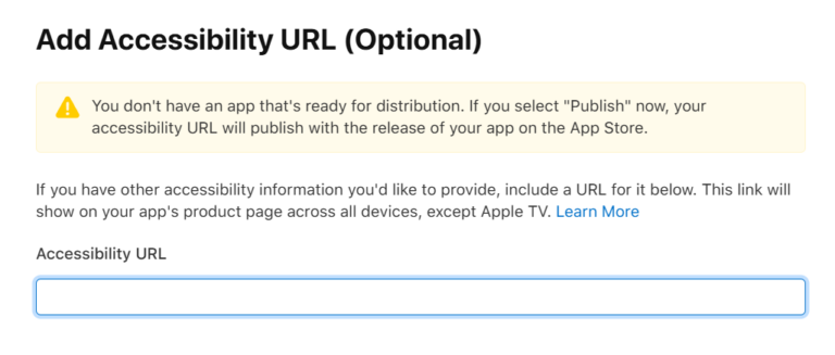
With all that out of the way, we’re going to talk a little bit about some of the accessibility options that are currently featured in Club Soko. Similarly to Tong, we’re doing this purely to be able to link to this post within the Accessibility URL for our iOS Launch in that oh so sweet input field. Fingers crossed if this helps our chances in the Apple team featuring the game when we launch as a result!
Why We Include Accessibility in Our Games
Accessibility in games is cool because it helps ensure that more people can enjoy, play, and feel included in the experience regardless of their physical, sensory, or cognitive abilities. Games are for everyone, and small design choices like customisable visuals, readable text, or simple control tweaks can make a huge difference for players who might otherwise feel excluded.
We often have this in our minds when we’re in the nitty gritty creative process of designing our games and the development of Club Soko was no different!
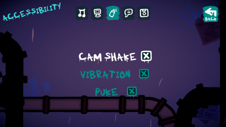
Camera Shake Toggle
Haptic Vibration Toggle
To reduce sensory discomfort and provide a more comfortable Club Soko experience, players are also able to toggle haptic vibration on or off via the settings. We added this to allows players to minimise unwanted physical feedback during gameplay. This functions both on mobile devices and for controllers across all supported platforms.
Sufficient Contrast – Visual Clarity
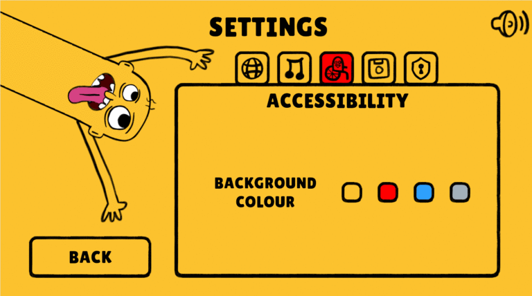
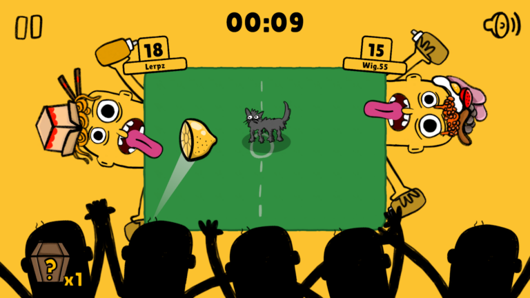
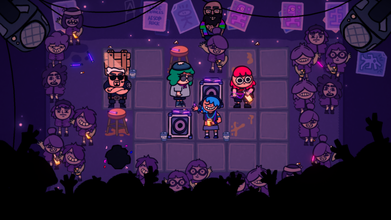
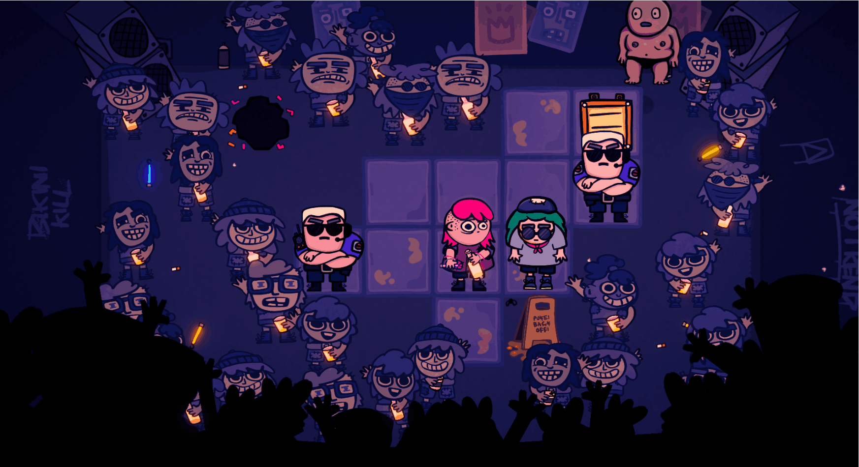
Club Soko is designed with high visual contrast in mind to ensure that all players including those with low vision or light sensitivity can comfortably read and interact with the game. We use pure white on textfields for all interactive UI elements like buttons, sliders, toggles etc. In game we use pure black outlines for interactive puzzle pieces to differentiate between foreground and background. Those pieces and characters feature vibrant colours to maintain clarity against both dark and desaturated nightclub backgrounds. Whether you’re playing in a well-lit room or a dim environment, the interface and interactive elements remain sharp, readable, and easy to follow.
Chill Music Mode
To create a more relaxed and comfortable gameplay experience, players can enable a ‘Chill Music’ mode via the settings menu. This option tones down the intensity of the game’s soundtrack, making it more suitable for players who prefer a calmer audio environment or are sensitive to more stimulating music. We explored similar features in Ruya and Alula back in the day which you can read about here!
Differentiate Without Color Alone
Textfields
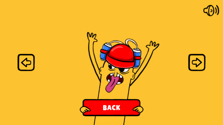
All of the textfields in Club Soko are scaled to be large, legible and have strong contrast. Club Soko uses all caps for buttons and headers to reflect the bold graffiti tone of the game and improve quick readability. The typeface we use is a custom Club Soko Font made specially for this project. We wanted something both handmade but legible to support a spray can graffiti style. Most textfields in the game feature all caps for consistency throughout. We’ll continue to monitor feedback and are open to adjusting this for dyslexic or visually impaired players that have difficulty distinguishing by shape, since using all caps might cause issues tied to the removal of ascenders and descenders in certain areas of the game.
Emetophobia Toggle
To support players with emetophobia or sensitivity to depictions of vomit, players are able to toggle this content on or off via the settings menu. This allows players to avoid potentially distressing visuals while still enjoying the core Club Soko experience. All of the sprites depicting vom get replaced with water instead in addition to textfields referencing it! Shoutout to our Discord community playtesters for bringing this to our attention and making it a feature!
Potential Future Accessibility Features
Accessibility is an ongoing process for our tiny team, but we’d love to expand Club Soko feature set to support even more players! Some feature ideas we’d like to add post-launch might include:
- Dyslexic Font – to improve readability and letter clarity for players with dyslexia or visual processing difficulties.
- Font Size Adjustment – to support different reading comfort levels.
- Grid Lines Toggle – for players that have a difficult time visualising the total size of a puzzle grid.
- More Language Options – we have the localisation package integrated in Unity and hooked up to a Google Sheet API with some initial UI ready to go for this in the Settings scene. We hope to support more languages in the future!
Feedback
As a small team, we know we won’t get everything right out the gate but we hope this offers some light into what we think about when we design our games games.
If there’s something that would help you enjoy Club Soko more, we’d love to hear it. We’re very curious if people have any issues with flashing or any of the camera motion in the game. Please drop us a message in our Discord and we’ll see if we can get it in the game!
Thanks for reading,
– Miracle Tea